

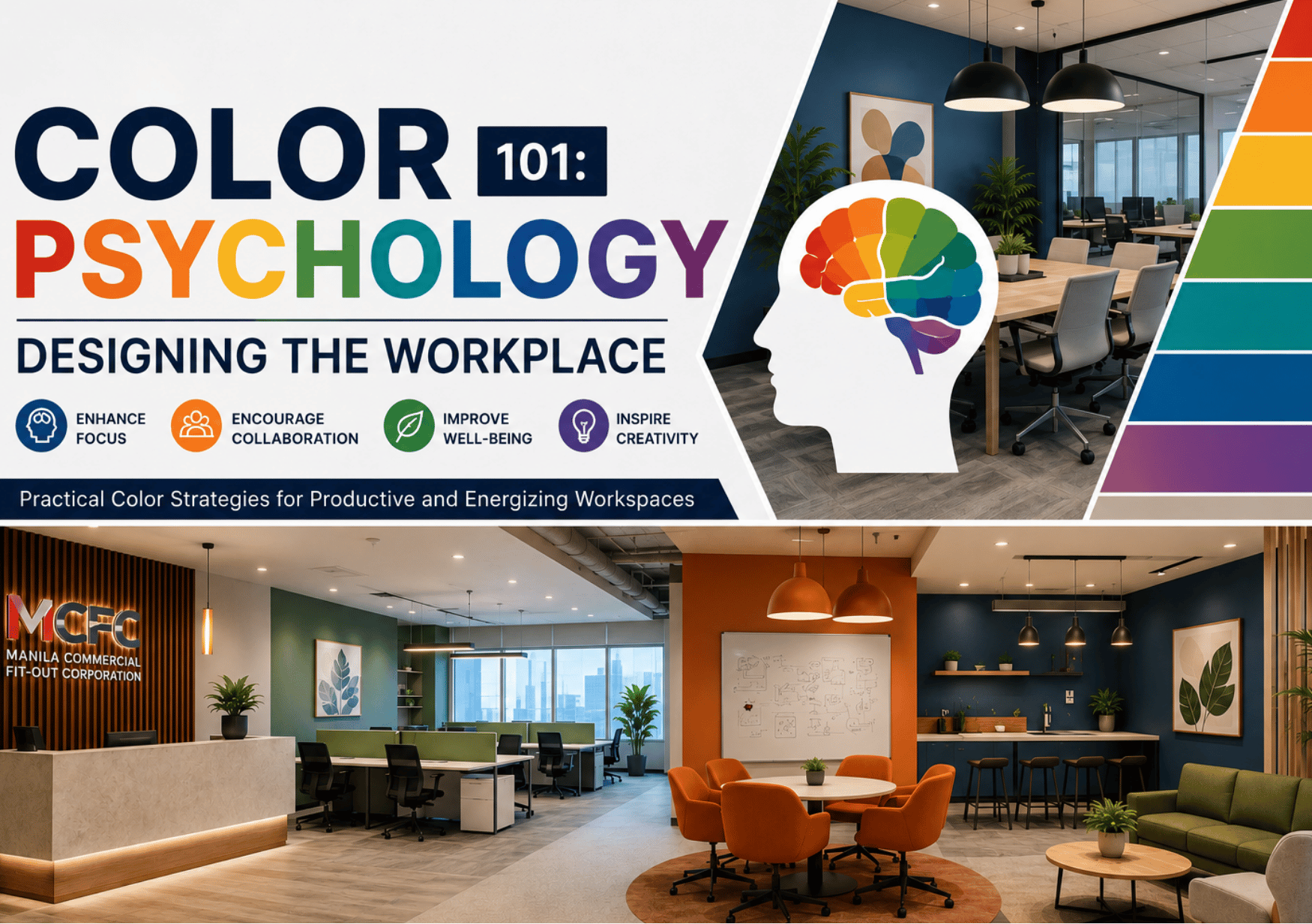
Have you ever walked into an office and immediately felt calm, energized, or inspired without knowing why? Color often plays a bigger role than people realize.
Beyond aesthetics, color influences how employees feel, focus, and experience a workspace. When used thoughtfully, it can help create environments that support productivity, creativity, and well-being. Let us explore how color psychology can shape office design and how different colors can be used to support different work environments.
What Is Color Psychology and Why Does It Matter in Office Design?
Color psychology is the study of how different colors influence emotions, behavior, and perception. In the workplace, color does more than affect how an office looks. It can also shape how employees feel, focus, collaborate, and respond to their environment.
The wrong colors can make a space feel distracting, overwhelming, or tiring. A well-planned color palette, combined with good lighting, layout, acoustics, and ergonomics, can help create a more comfortable and productive workplace.
When choosing colors for a workspace, it is important to consider how each area will be used. Colors that support focus may work well in quiet work areas, while warmer or brighter tones may suit collaborative spaces.
How Different Colors Influence Your Workspace
Different colors can shape how a workspace feels and how employees respond to it. While color alone does not determine productivity, a thoughtful palette can support focus, inspire creativity, and create a more effective work environment.
Warm Colors: Encourage Energy and Interaction
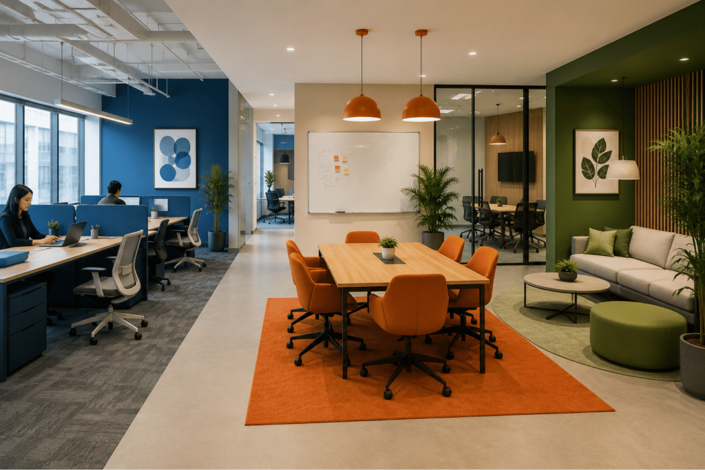
Warm colors naturally create a sense of energy and movement, making them well-suited for spaces where people gather and collaborate.
- Red: Use red sparingly to draw attention or create a sense of urgency. As an accent color, it can energize a space, but excessive use may become distracting or overwhelming in work areas.
- Orange: If your goal is to encourage conversation and teamwork, orange is a strong choice. Its warm, welcoming tone works well in breakout areas, lounges, and collaborative spaces.
- Yellow: Yellow is often linked to optimism and creativity. Softer shades can brighten reception areas or brainstorming spaces, while highly saturated yellows are best used as accents to avoid visual fatigue.
Cool Colors: Promote Focus and Calm
Cool colors create a calmer atmosphere, making them ideal for spaces where concentration and sustained attention are important.
- Blue: Blue is widely used in workplaces because it promotes focus, mental clarity, and a sense of calm. It works particularly well in offices where analytical or detail-oriented work is common.
- Green: Inspired by nature, green creates a balanced and comfortable environment. It is especially suitable for workstations, as it can help make long hours at a desk feel less visually tiring.
- Purple: Lighter shades of purple introduce a subtle sense of creativity and reflection. They are often used in brainstorming rooms, innovation spaces, or wellness areas.
Neutral Colors: Provide Balance and Flexibility
Neutral colors create a clean foundation that allows other colors and design elements to stand out without overwhelming the space.
- White: White can make an office feel brighter and more spacious. Pairing it with wood finishes or warmer tones helps create a more welcoming environment.
- Grey: Grey provides a professional and versatile backdrop. To keep the space from feeling flat, combine it with accent colors or textured materials.
- Beige and Off-white: These softer neutrals create a warmer, more inviting atmosphere while maintaining a clean and timeless appearance.
- Black: Black works best as an accent. When used thoughtfully, it adds contrast, definition, and a modern touch without making the space feel heavy.
Designing by Zone: Matching Colors to Function
Instead of relying on a single color throughout the office, combine different tones based on how each space will be used. Matching colors to the function of each area can help create a workplace that feels comfortable, purposeful, and supports the way people work.
Reception and Entry Areas
This zone sets the psychological tone for your entire organization. It is best to choose warm, welcoming, and confident tones paired with rich, natural materials that reflect your brand identity. This palette ensures visitors and employees feel immediate ease and security upon arrival.
Focus and Individual Work Zones
For areas dedicated to focused work, choose cool, subdued tones such as soft blues and muted greens. These colors help create a calmer environment, minimize visual distractions, and make long periods of desk work more comfortable on the eyes.
Collaborative and Meeting Spaces
Collaboration hubs should feel active, welcoming, and easy to use. Try adding warm accents, richer orange tones, or brighter yellows to encourage conversation, bring energy into the space, and support brainstorming.
Break Rooms and Social Areas
These spaces should help employees pause, recharge, and mentally step away from work. Consider using earthy terracotta tones, leafy greens, and warm timber elements to create a calmer setting that feels separate from the main office.
Executive and Client-Facing Rooms
These rooms should feel professional, calm, and reassuring. Consider deeper tones such as navy, charcoal grey, or muted forest green, paired with quality materials to create a sense of credibility and confidence.
Practical Tips for Choosing an Office Color Palette
It can be tempting to use your brand colors across the entire office, but strong colors that work well in a logo may feel overwhelming on large walls. A better approach is to use brand colors as accents through feature walls, chairs, acoustic panels, or soft furnishings, while keeping the main palette balanced and comfortable.
To plan your office colors well:
- Test Colors First: Apply large paint samples and observe them under natural and artificial light before committing.
- Use the 60-30-10 Rule: Keep 60% of the space neutral, 30% in secondary colors, and 10% for stronger accent colors.
- Think Beyond Walls: Flooring, ceilings, furniture, and finishes all affect how colors feel in the space.
- Use Flexible Color Accents: Add color through furniture, upholstery, desk dividers, or acoustic panels that can be refreshed later.
- Keep Transitions Smooth: Use shared tones between zones so the office feels connected rather than visually disjointed.
- Ask Employees for Input: Staff feedback can help identify colors that feel comfortable, practical, and supportive for daily work.
Let Us Help You Choose the Right Office Color Palette
Choosing the right office colors involves more than matching them to your brand. Lighting, materials, furniture, layout, and the way your team works all influence how colors look and how the space feels.
At Manila Commercial Fit-out Corporation, we help you choose a color palette that complements every part of your workspace, from focus areas and meeting rooms to reception and breakout spaces. We also provide end-to-end office fit-out services, including space planning, furniture supply and installation, civil and structural works, and MEPF systems, to deliver a workspace tailored to your business needs.
Contact us today to create an office that looks cohesive, feels comfortable, and supports the way your team works.